Archive for the ‘design binding’ Category

1984 pt. 6 – housing

Wednesday, April 17th, 2013

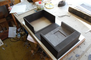
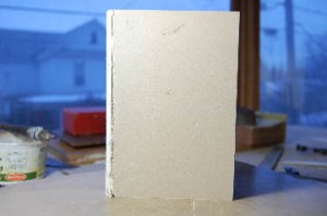
Finally, the box. The book originally came to me with an incomplete dust jacket; probably the circumstance which made this copy suitable for rebinding. However, the dust jacket was still worth preserving, so I made a cloth covered two-flap portfolio for it, and built the box inner shell according to the Library of Congress plans for a box and portfolio.

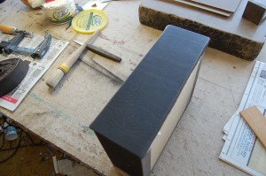
The inner shell was constructed so as to fit both the portfolio and the finished binding. The shell was covered with gray Iris bookcloth. After covering the shell and portfolio were airbrushed with a combination of raw umber and black to bring down the tone The shell was lined with gray suede adhered to thin board, turned in, and glued into the shell. Next the outer shell was built, covered and airbrushed.

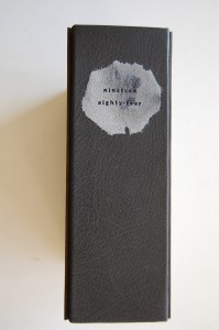
The board for the spine was covered with a a piece of the same gray leather used for the binding, turned in head and tail, and then adhered to the bases of the shells. This style of box was a favorite of the Eberhardts; I like it because the flat spine with the leather disappearing under the boards makes for a very contemporary box, as opposed to the rather Victorian round spine (sometimes with fake bands) extending well onto the boards.

The boards were covered with gray Iris, and the same aluminum patterns used for the onlays did double duty as airbrushing masks.

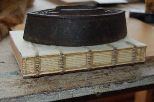
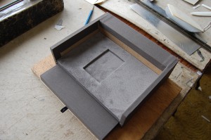
This image shows the box after the spine lining cloth was attached, and before the suede lining pad for the outer shell was made and adhered.

The final step was to pare, line and stamp an irregularly shaped piece of suede for the box label and and adhere it to the spine.

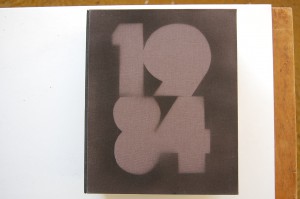
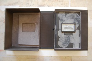
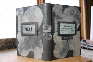
And an image of the final presentation. I want to thank the client, who was willing to let me share the documentation of this extremely gratifying project.
1984 pt. 4 – telescreen & door number

Sunday, September 2nd, 2012

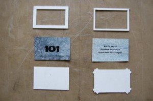
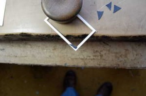
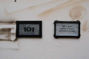
The insets for the front and back are comprised of frames and backing pieces of two-ply museum board. While differing in detail, they are the same size, and echo the proportions of the book. The image for the telescreen consists of a background of tv snow printed digitally onto Rives paper;  the text was printed letterpress using Franklin Gothic type. The door number was printed using small wood type onto a piece of gray over black paste paper. The toned gray leather for the frames was pared out on the Scharf-fix until it was quite thin.

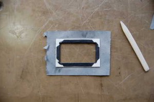
As is the case with such frames, the inside corners had to be covered before the main leather was adhered.

Then the covering pieces were adhered, cut and turned in.

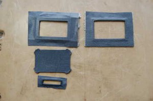
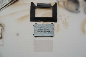
Because the backing piece for the front frame (the middle piece on the left) has little ears that are intended to be visible, it had to be completely covered. The small frame below it is for the speaker.

Here’s the telescreen before assembly. The frame covering leather needed to be cut so as to fit around the ears on the backing piece. And below you can see the Vyvek plastic which covers the image.

The assemblies are held together by the covering leather wrapping around the backings. Since neither the images nor the Vyvek pieces are adhered to the backings there’s no problem with expansion or pull.

Once these units were finished, I traced the outlines onto the boards, added a bit to allow for the covering leather, and cut out  the outer layer of museum board where the insets were to go. At this point it was time to prepare the covering leather and the large onlays.

1984 pt. 3 – spine consolidation and boards

Monday, May 16th, 2011

After sewing, the endsheets were tipped to the loose guards. The spine was then glued up with hide glue, squared up to head and spine and allowed to dry.

Here’s a view of the texblock after rounding…

and here it is in the press prior to backing.

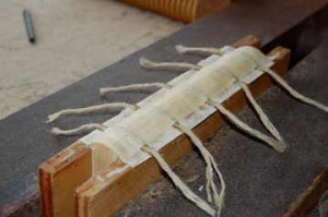
After backing, the spine was lined with two layers of machine-made Okawara pasted between the cords and just over the kettle stitches and a third layer cut to cover the spine just shy of the kettle stitches; this to make allowance for the endband sewing. The lining papers were cut wide enough so that they could be adhered to the pressing boards. By doing this the linings are pulled tightly onto the spine as they dry. The book remained in the press overnight. The next day I used a bone folder to separate the text from the pressing boards, removed  the book from the press, cut the cords to about an inch on both sides and frayed to cords out.

To equal the depth of the shoulders and to accommodate insetting the door number and telescreen elements the boards were each laminated from two pieces of two-ply museum board with a layer of handmade paper between them. While they were drying I airbrushed the textblock edges with more acrylic black and raw umber.

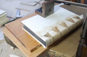
When the boards were dry they were squared up, cut to size, and a two-ply spacer tipped along the spine edge of each.  The frayed slips were then used to attach the boards to the textblock utilizing hot glue and paste. Endband cores were laminated from leather and vellum, cut to a triangular cross-section and adhered to the texblock with small pieces of Sekishu, as can be seen above.

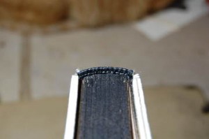
The endbands were sewn with two colors of silk, then the ends of the cores were trimmed off and glued.

Finally, the boards were lined on the outside with handmade paper and sanded smooth, and a tube of machine-made Okawara prepared and adhered to the spine of the book.

Next episode: cover insets.

1984 pt.2 – endpapers & sewing

Monday, April 11th, 2011

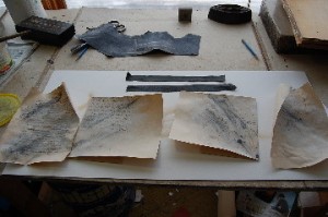
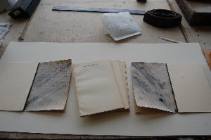
The endpapers were made up from a sheet of Twinrocker handmade paper that I had in the shop. The front pastedown and flyleaf imagery is lettering written with a pointed pen in an intentionally unformed style; that on the pastedown is the first passage the Smith writes in his journal, and that on the flyleaf is the phrase “Down with Big Brother” repeated halfway down the leaf. Across the rear pastedown and flyleaf was written” 2+2=5″ in a shaky hand, and some spatters and rings of acrylic were added. Then all four papers were worked with a mixture of raw umber and black acrylic in paste. Leather joints were cut out and overall pared to the thickness of a piece of one-ply museum board using a Scharffix and edge-pared by hand along one long side. To tone the color of the leather down a bit I lightly airbrushed the joints with raw umber and black.

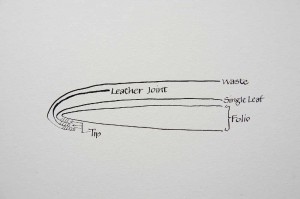
The endpapers were assembled as in the above diagram. The sheets with the imagery were tipped to the folios, with the images facing out. The joints were tipped next, then the waste sheets. The waste sheets were Hannemuhle Ingres. For clarity, the diagram does not show the additional protection sheet of oaktag inserted between the joint and outer fly, or the compensating piece of one ply next to the joint.

After assembly the endsheets were pressed and cut to size. They were then pressed with the textblock. Because of the value of the book, the edges were not trimmed.

Before marking up, loose guards were folded and added to the outermost signatures. The textblock was marked up for four flat cords and new kettle stations, and all the stations cut into the textblock spine with a very sharp knife. The endpapers were pierced with an awl at the stations.

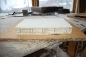
Including the endpapers, the book was comprised of 12 signatures. I chose to use #25 thread, which turned out to give just a little less swell than I had planned, but it worked out pretty well anyway.

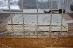
Here’s the sewing in progress…

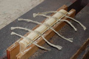
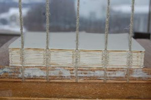
and here’s the textblock sewn, before taking it off the sewing frame.

Next: spine consolidation and boards.

1984 pt.1 – design

Sunday, March 27th, 2011

In January and February of this year I executed a commissioned design binding on a first edition of George Orwell’s 1984. In a rare spasm of  good sense I took photos of the process, and, with the approval of the client, will be posting them along with comments.

I have to admit that I hadn’t read the book previously. When I did, I was struck by both its truly frightening timeliness and the rich imagery that Orwell uses to describe his sad, impoverished world. From this, four images stood out for me and became the basis for the design. Early in the book Smith begins keeping a diary in an illicit blank book. Orwell describes the book’s physicality in detail worthy of any bibliophile, whereupon Smith begins writing in graphic detail about a film showing the sinking of a ship carrying enemy noncombatants. As his mind wanders he finds himself writing “Down with Big Brother” over and over. Shortly thereafter we are introduced to the telescreen, which both receives and transmits images and allows the government to observer everyone in their apartments.. Toward the end of the book Smith’s will is broken in Room 101; we see him finally sitting in a bar, drunk, writing “two plus two equals five” on the table and realizing his love for Big Brother. Finally there is the iconic title itself. After a number of thumbnail sketches it was time to produce a definitive design.

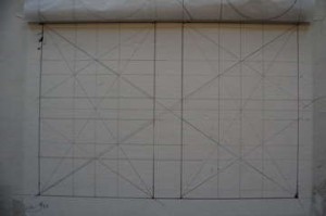
As usual at this point I generated a full sized armature as a scaffold for the design. For more info on this technique, check out Jay Hambidge’s Elements of Dynamic Symmetry and The Painter’s Secret Geometry by Charles Bouleau (which seems to be very difficult to find at a reasonable price these days; hence, no link). And if you really want to see how great artworks can be produced based on the geometry of the rectangle, go here.

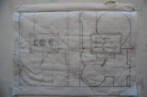
Variants were worked on tracing paper over the armature until the final design (above) came together. You can see the two rectangular elements of the door sign for room 101 and the telescreen over the title. I originally thought that the 19 and 84 elements might range above and below the surface of the binding, but that didn’t work out.I wanted a skin with flaws, and ordered a third quality gray skin from Talas.

Next: endpapers and preparation for sewing.